Carbon Design System
Timeline
March 2016 - April 2018
2 years & some change
Role
UX Designer, UX writer,
Design Lead
Team
Mari Johannessen, Tayler Aitken, TJ Egan, Bethany Schwanke, Anna Gonzales, Chris Dhanaraj, Christine Tsai, Ian Fleming,
Brian Han
Tools
Sketch, GitHub, ZenHub
Overview
Carbon is the design system for IBM Cloud products. It is a series of individual styles, components, and guidelines used for creating unified UI. The design system is comprised of the Carbon documentation website, Sketch Design Kit, and Component Library. As part of the inaugural design systems team, I oversaw the user experience for each component, wrote design guidelines to accompany them, and managed content on our website. I also worked closely with our Developer Lead to plan sprints, roadmap for future releases, and meet with product designers and developers to anticipate product needs.

Discovery + research
Our efforts to build out the design system began with understanding our product's landscape.
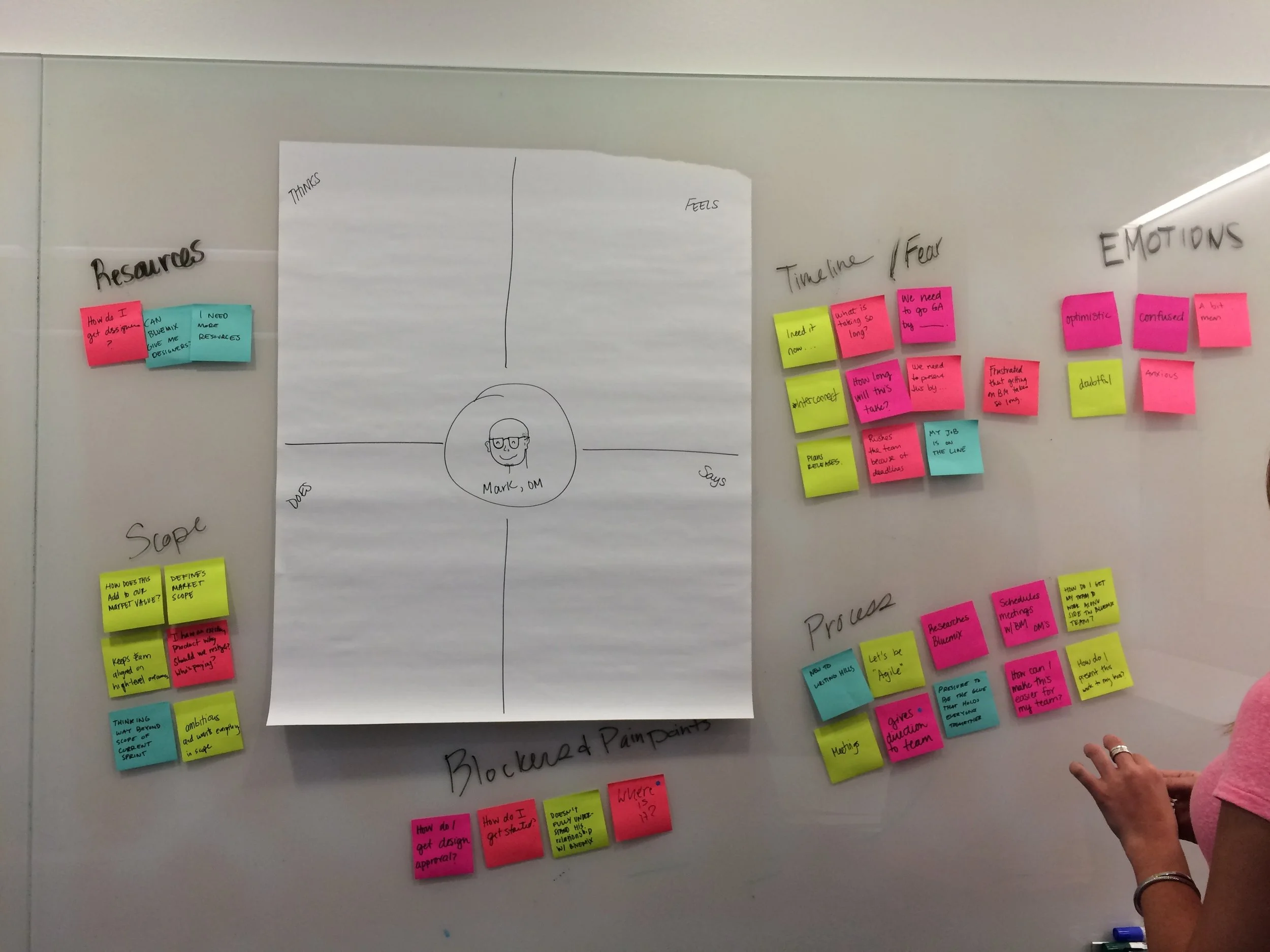
points of discussion
Which service teams could be sponsor users?
What would be considered an MVP?
What foundational elements do we need?
Which components would we need to build for a seamless integration into product?
Our main challenge was integrating a design system into a product that had existed for two years, had already accumulated some legacy code, and had over 100 design and engineering teams spread across the globe.
You can read more about the story behind Carbon and the challenges we faced early on in this Medium article.
Setting an end goal
“An IBM offering team can discover, understand, and use the Carbon Design System to independently build their IBM Cloud approved experiences.”
Delivering a MVP
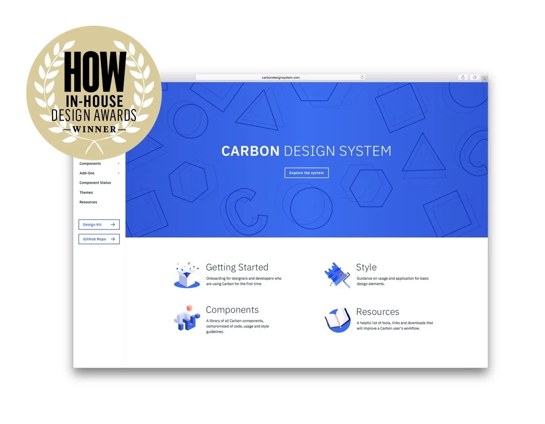
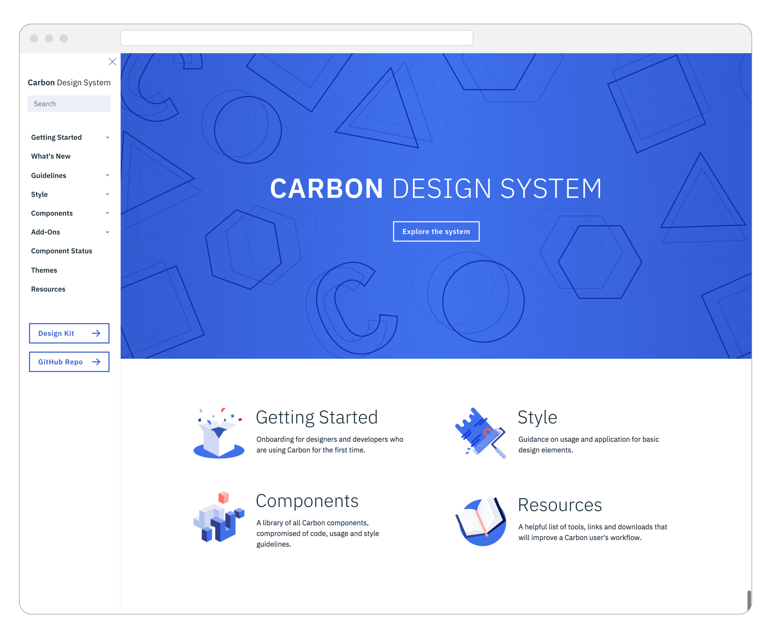
Website
The Carbon website contains documentation on each component, provides detailed usage guidelines, best practices, and FAQ on using the system. The website was built as a React app, and included a markdown parser so designers could feel comfortable creating pull requests to update content and imagery.
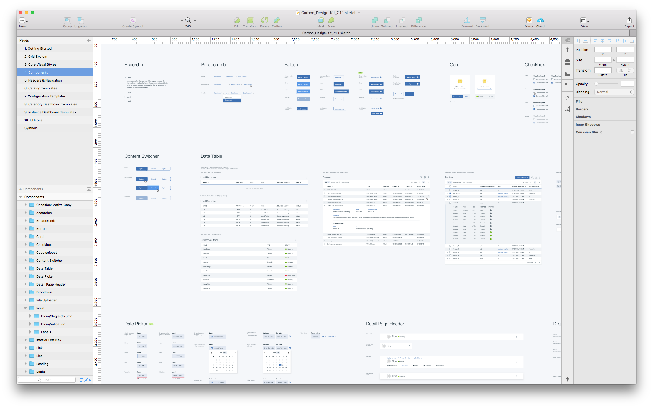
Design Kit
The Carbon Design Kit provides UI components in a Sketch file that designers can use to quickly prototype. We used GitHub to maintain the different versions of the Design Kit, and continue to use that platform for version control.
Component library
The Carbon team maintains two libraries of the core components: Vanilla Javascript and React. We have since added Add-on libraries, which support the needs of various product teams across IBM.


Maintaining & scaling
How do you scale a ten person design systems team across an organization with over 130 teams?
Challenges
Scaling our research efforts across the IBM Cloud portfolio (Mobile, Watson, Infrastructure, and core platform).
Frequent communication with our sponsor users (product designers, developers, and engineers), to ensure the system fit their needs AND the product's needs
Increasing adoption across IBM's broad spectrum of Cloud products
SOLUTIONS
The Carbon team started two bi-weekly meetings: Carbon Sessions and Component Check-ins
These allowed us to share out what our team is working on, while also learning about the different component needs from our sponsor teams
It also gives product teams a chance to ask questions and give feedback on the system
Component check-ins
Face-to-face communication with our sponsor users

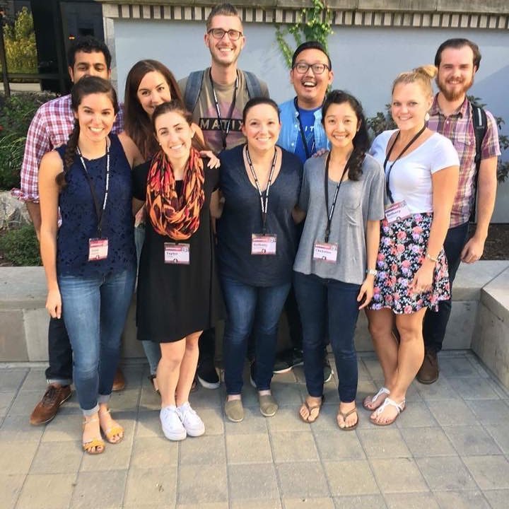
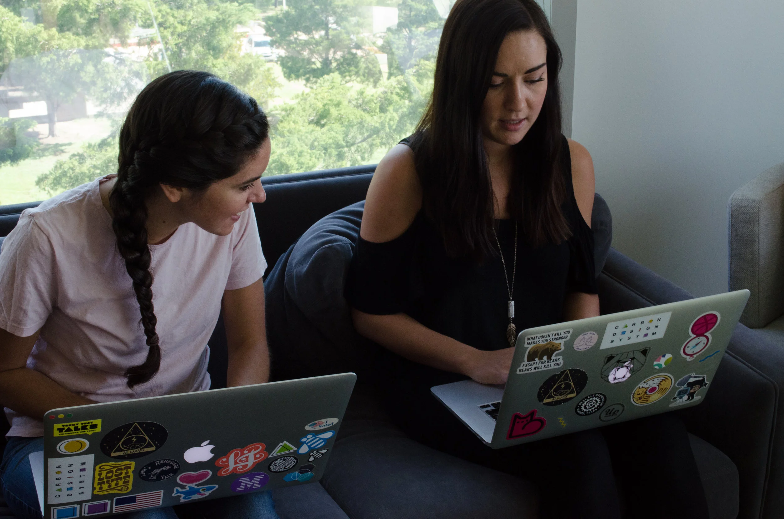
Team building
Team culture was extremely important to us, therefore we made sure to spend time outside of the office investing in team building activities, such as attending conferences, sweating it out at SoulCycle, boating, and thinking of new and creative ways to decorate people's desks for their birthday.